
Website Designs of the 90's
 I was taking a look back at the technologies of computers the other day with a friend. It was astonishing how computer technologies have changed so rapidly. So I thought, wouldn't it be interesting to take a look at what website looked like in the later part of the 90's and what techniques were used.
- Animated .GIF files.Yes, we really thought these made our sites look cool! I love these thing!
Combine this with Times New Roman font and it’s 1995, all over again! - Cheesy clipart icons. Graphics programs have come a long way (can you say CS4?). Free and almost-free stock image sites are abundant. There is NO excuse for using crap like this today:
- Layout tables with borders. We all know (or should know) that CSS is almighty and that you really shouldn’t be designing layouts using tables. There are always exceptions, but that’s for a different article. You want your readers to flash back quickly? Give your layout table a border. At least if you are using tables to create your site, the lack of a border doesn’t make it obvious.
- Overbearing, non-seamless, repeating background tiles. Okay, admittedly, web design in the early 90s had major limitations and you were considered a progressive designer if you had a repeating background. Photoshop was still in its infancy, so seamless tiles were hard to come by. These days, there is nothing wrong with a repeating pattern but the rules have changed. Make them fade into the background, not stand out. And make them seamless and appropriate to your content. When it doubt, leave it out!
- Blue and Purple links. If you can install a theme/template, use any HTML editor, or do a Google search for CSS, you can change the color of your hyperlinks.
- Times New Roman and Comic Sans. Using either of these fonts for you body content tells the world you’re watching reruns of Beverly Hills, 90210.
- Centered text. For everything.
There were so few tricks of the trade in the 90s,
web designers did anything they could
to make their stuff stand out.
Centering body text was one of those ‘tools’.
Back then, I guess a lot of designers didn’t care that there text was not very readable. - Blinking text. Fun, isn’t it? For those of you who started coding after 1998, you can acheive this by simply using the
blinktag. (update: for some reason theblinktag won’t work with this Today.com theme. Bummer. You don’t know what you’re missing.) - Psychedelic buttons. You know the ones. pretty, funky, rainbow gradients with beveled edges, that showed off your mad Photoshop skills. Buttons like this one:
- Flash splash pages. Back in the 90s, all the cool kids toyed with Flash. Anyone who could make a logo rotate in an non-animated-gif way, and included a moving link to enter the page, well they are now the ones making kick-ass GUI interfaces. But back then, they made really annoying, no-use-whatsover splash pages.


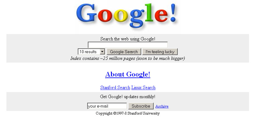
Google.com in 1998
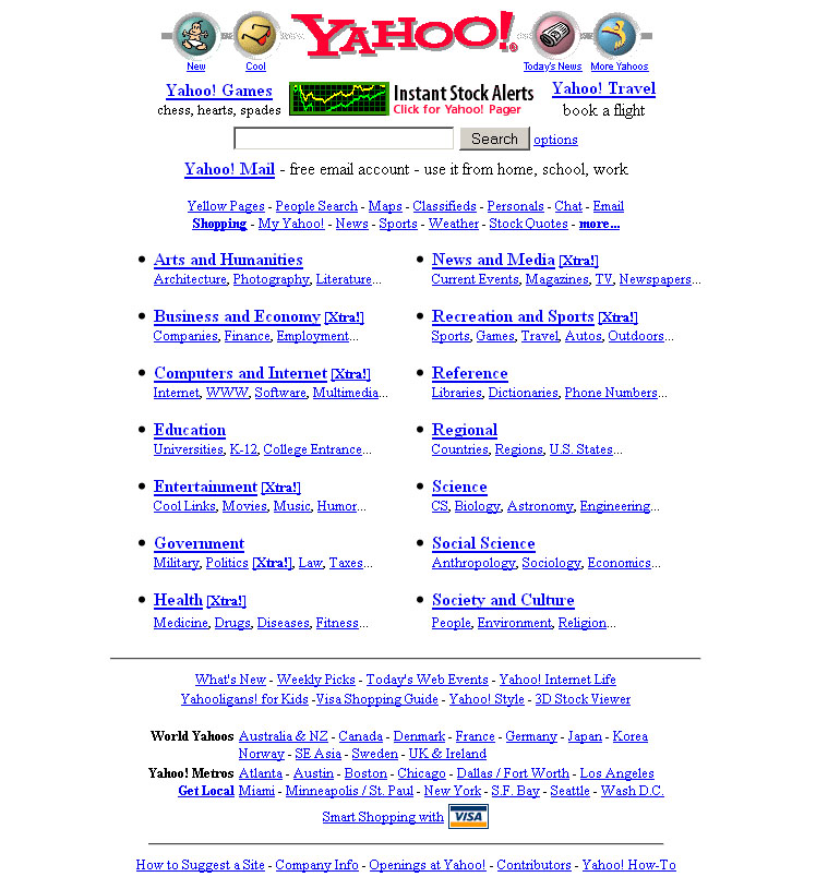
Yahoo.com in 1999
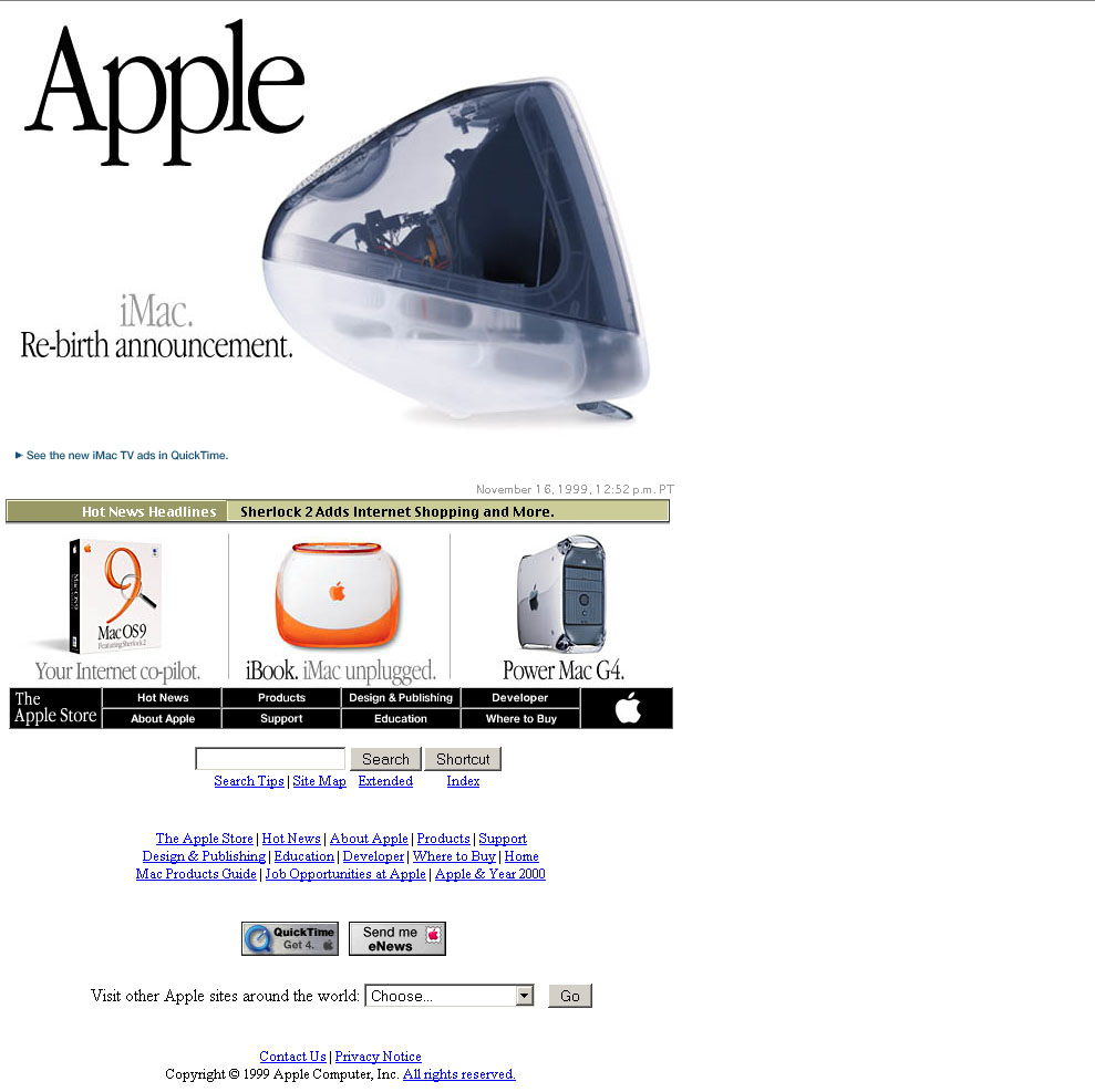
Apple.com in 1999
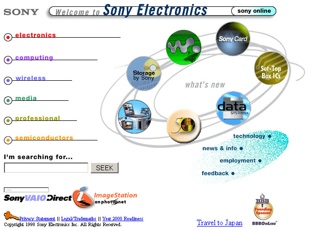
Sony.com in 1997
Reference: How Popular Website Designs Looked Like In Late 90’s, Web design history, a look at the 90s


1 Comments | Post A Comment
Awesome!
ReplyDelete