When I first saw these poster designs by
Mark Brooks it immediately caught my attention and sucked me in. The color tones and the minimal yet subtle design of each poster had me searching around for more of his work. Mark designed these posters for
SantaMonica a Barcelona based brand that presents a very solid and refined graphic identity with there prints and t-shirts.
The one that really caught my attention out of this series of posters is the particle acceleration poster with the giraffe. The idea and the concept are quite interesting using the spots of a giraffe to symbolize the idea of particles separating. Well I will leave you to checking out the posters now but I will leave you with a little fact about giraffe's. The word "giraffe" comes from an Arabic word, "zirafah", which means "the tallest of all".


 Source: Behance
 Parachute Journalists
 is an indie/folk/punk band with members
Jeff Finley and
Adam Wagner from
Go Media in Cleveland, Ohio. This gig poster below was created for a January 9th concert at the 5 O’clock Lounge. The first poster below is one of many items intended to define the visual branding of the band. I have also added a couple of other poster designs I found for the band that were created by Go Media. I'm really enjoying the concept and the feeling of each poster. The first poster though has some really good composition in form, color and association.
If you want to check out the bands music check out this
link.


Source: rafdevis

I came across
Network Osaka on
Flickr and man was I satisfied with what I found. This guy has some great talent and he should. He has been doing graphic design since way back in 1992 on his Macintosh LC.
When I was reading up about him on his about page. He said something about graphic design that caught my attention. He said, as a designer, I strive to engineer form and function in complete harmony. Removing unnecessary design elements and having a concise and direct approach to design problems will ultimately create a successful product valued for both its content and its design.
I went through his Flickr sets and picked out some of my favorites. If you get a chance check out his
Flickr and his
Website. You won't be disappointed.


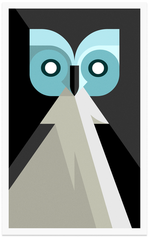
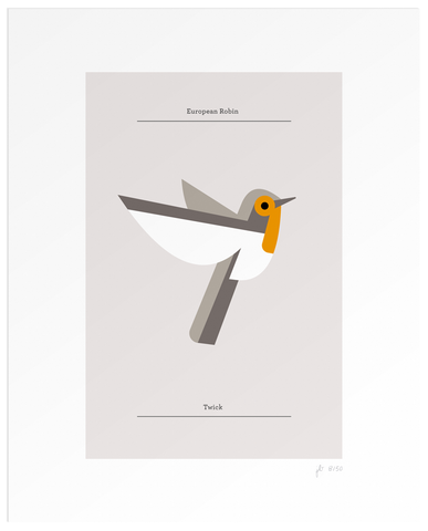
Lumadessa is a little art and design label by
Josh Brill. Focusing on limited edition art prints and design products, that implement premium materials and production methods. Resulting in timeless works with longer display lives. In these limited edition prints is his
Flora Fauna Birds Edition which is full of different styles of birds. The Flora Fauna collection is a cataloging of the design identities of plants and animals from around the world. Examining the visual character differences and similarities of species. A field guide of discovery, beginning with birds. For each of these prints that are sold 5% of the profits are donated to Animal and Environmental charities which I think is a great idea. Here are a few of the designs. If you want to see more than head on over to his
website.


 Mehmet Gozetlik
 has made a poster set about the old school 3.5 inch floppy disks. Higher density drives are built to read, write and even format lower density media without problems, provided the correct media are used for the density selected. Below is how many floppies it would take to run these current software's.
If your interested in buying these posters then head on over to
Antreposhop.comResult (Approximate)
46 disk for
iTunes 8.02358 disk for
Adobe Photoshop CS41760 disk for the
Sims 312 disk for
Firefox 3, 36 disk for Firefox Add-ons


Stephane Massa-Bidal is a French illustrator who combines the past, present and future into his works. On his site
Retrofuturs he has numerous series that are worth checking out. Although, there was one series in particular, that caught my attention. That was the
"Life is Circle" series. The reason it caught my attention is because life moves in a circle and things always come back around in some form. So his idea matches the concepts in which he portrays. In this series he takes different photographs and places them in circular form to represent life as a circle. I get the idea that each has a meaning like the first one below is the circle of space and land. The layering and textures and feel of this series is fantastic. He also uses Helevtica type for his number sequence if you wanted to know. Now that you know, I'm sure you're wondering what the numbers mean. Well I think I can answer that. From a post on
Wanken he stated that there was no significance about the numbers, just esoteric numbers.
So I highly recommend checking out more works by
Stephane and if you want follow him on
Twitter.


I'm always on the look out for new artists and designers that catch my attention.
Drew Rois is one of those artist that caught my attention with his collection of
Space Posters. He started a little studio called
Rokk Hard which he states is a amalgamation of two very different genres of music; Metal and Disco. With powerful visual hailing from both genres, they are inseparable in my mind, and this is what drives my work.
What I like about his space poster collections is that what seems to be a simple design can really be seen as a multitude of layers which comprises to make a modern simple look. I would have to say though my favorite one is the Astroknot posters with its vintage style look and its great choice of colors to match the style in which he was going for. It's like looking at a rip in the universe and you only get a strange glimpse of Earth. (Sorry had to geek out for a minute). If you want to check out more of his work or follow him on his social networks check out his
website.


Lindsey Carr is an artist living and working on the south west coast of Scotland. Where she produces some amazing works with acrylic and oil on wood. She also makes some interesting toys as well. This girl is very talented to say the least. I like her use of deep tone colors in each of her works. She uses birds and different animals to represent her mystical and magical world that her works take you to. You can get lost in the great details that she puts in each of her projects. If any of you are interested she does have prints for sale at
society6.com. If you want a more comprehensive look into Lindsey's world of work it can be found on her
blog,
Little Robot, and her
Etsy store as well.