It has been a while since I have written about
branding but
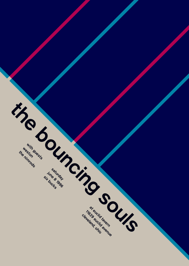
Branch Creative caught my attention. Their solid color choices with minimal lines and typography kept me focused and interested in what they were displaying.
Here is a little bit about Branch Creative:
Branch Creative is an executive production and advertising house that represents a pool of photographers, illustrators and commercial directors from around the world. We created a sophisticated identity system with a playful typography treatment.
See more of their branding material on
Behance.


Creative illustrations
Ji Lee shows the meaning of different words with images. The goal was to create visual representation of a word, using only the letters that are contained within the word itself. If you want to see more, you can always purchase his
book.
 Tim Wan
 is the creator of the
Predictions Calendar Series. He states, "It's a series that interprets the definition of fakery by tampering with true events; placing them outside their original context to mislead, trigger nostalgia, and remind people of past events". It was such a success that it was awarded membership to
International l Society of Typographic Designers. Not bad for someone who just graduated.
I personally find these calendars to be a great example of good design from the color palette choices to the layout and typography used in the design of these calendars. To bad these are not for sale. If they were they would be hanging in my house right now.
Click through to see more of
Tim Wan works.


 Source: Aisleone